Freelance Essentials: Creating Your Own Website
Let’s face it, freelancing isn't just about the work — it's about building trust. And these days, your website is often the first hello. Gone are the days of firm handshakes and eye contact. Now, your digital self does all the talking.
Your website is your first handshake in the freelance world. Is it confident and clear — or just a limp, awkward wave?
As someone who's tripped through the freelance maze, I know one truth: your website isn’t just a showcase — it’s you on display. Every click tells a story. Every scroll builds or breaks trust.
Your website is your virtual office, your personal pitch, and your brand's loudest voice. It's where potential clients get a feel for your vibe and decide whether to swipe right on your services.
Unexpected Insight: I used a free domain in my early days. Big mistake. It said more about my hesitation than my hustle. Spoiler: no one hired me that month.
Elevating Your Freelance Game with a Personal Website
If your website walked into a client’s inbox, would it turn heads — or get ignored like yesterday’s spam?
A killer freelance site isn’t about flashy graphics or clever code. It’s about building connection. Your digital space should whisper, “I get you. I can help.”
Pro Tip: Your homepage should answer, “Why should I trust you with my money?” If it doesn’t, fix it.
Building the Backbone of Your Freelance Website
If your website were a house, is it held up by bricks — or built on sand?
Freelancers, here’s your blueprint. Your site needs structure. Purpose. Personality. Let’s lay it down piece by piece.
Personal Note: Starting Small with Canva
Before I ever bought a domain, I started experimenting. As a beginner, I used Canva to build my first simple portfolio website. It wasn’t perfect — but it gave me confidence, helped me visualize structure, and let me test ideas without pressure.
➡️ You can check out my experimental site here: https://fhmhussein.my.canva.site/digitalmarketing
I created this layout using Canva’s drag-and-drop builder. It’s a great starting point if you're still learning and not ready to invest. I kept the layout minimal, focused on clear messaging, and made sure it reflected my voice.
Then I chatted with a fellow freelancer, and they said what I now believe 100%: "If you want clients to take you seriously, you need a real domain." That advice stuck.
Now, I’m working on my full website — with a real domain and professional hosting — because this freelance thing isn’t a hobby anymore.
#1 Domain Name and Hosting: Lay the Foundation
Want to look legit? Stop freelancing from someone else’s backyard.
- Your domain is your street name.
- Your hosting is the land it sits on.
- Your brand? That’s the whole vibe.
Now, there are free options out there, but let me tell you from experience, they're like showing up to a client meeting in joggers. Sure, technically it works, but it doesn't exactly scream "credible freelancer." I once used a free domain, and let’s just say... clients didn’t take me seriously. When I upgraded to a custom domain, inquiries started rolling in.
Pro Tip: Always go for a .com if possible — it still screams credibility.
#2 Visual Identity: Let Your Brand Speak Loudly
Design isn’t about looking fancy — it’s about being remembered.
Your site design is your vibe. Get it right, and people feel your professionalism before they even read a word.
✅ Clean layout
✅ Strong logo
✅ Consistent color palette
✅ Mobile-friendly
Pro Tip: Your logo isn’t optional. Invest in a simple one — it’s your signature.
#3 About Page & USP: Tell Them Who You Are
Freelancing isn’t a resume — it’s a relationship.
Use this page to talk human-to-human.
✅ Share why you do what you do
✅ Show your passion
✅ Highlight your Unique Selling Point (USP)
✅ Add a friendly, professional headshot
Pro Tip: Your USP doesn’t belong in paragraph #5. It belongs in your tagline, front and center.
Mini-Fail: I once buried my unique process in dense text. Clients missed it. When I moved it to a subheading? I booked 3 new leads that month.
#4 Services, Portfolio & Testimonials: Show Off (The Right Way)
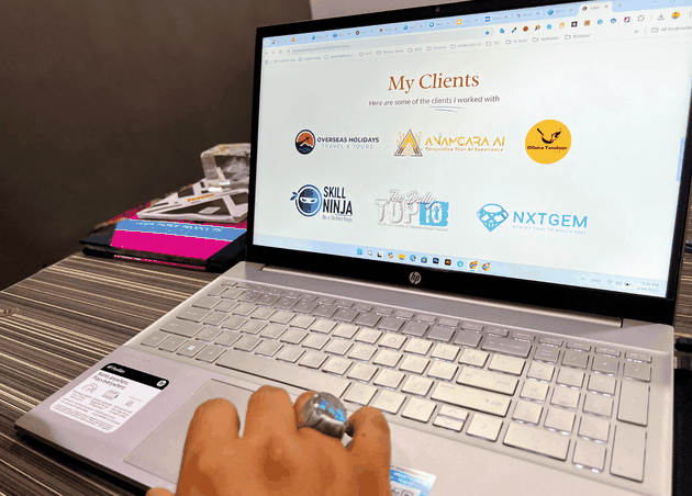
Don’t just say you’re good — show receipts.
Services Page:
✅ List what you offer — clearly.
✅ Explain benefits ("I write copy that converts.")
❌ Avoid buzzwords ("synergistic deliverables")
Portfolio Page:
✅ Share only your best 3-6 projects
✅ Include a short case study per project: problem > process > result
❌ Don’t post everything — keep it curated
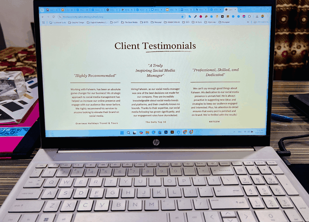
Testimonials Page:
✅ 3-5 client quotes with name/photo
✅ Make them specific (include results)
❌ Skip generic praise
Bad Example: “Great work. Will hire again.”
Good Example: “Faheem helped us double conversions in 60 days with clear, persuasive copy. His communication and process were exceptional.”
Pro Tip: Don’t just post praise — frame it. Use it to highlight your process and results.
#5 Rates: Be Bold, Be Clear
Transparency builds trust. Hiding your rates might just hide your value.
Why I stopped hiding my prices: Clients ghosted me after we talked numbers. Once I put a starting price on my site? I only got leads who were serious.
✅ Show pricing tiers or starting ranges
✅ Offer value-based packages
✅ Invite inquiries for custom quotes
Pro Tip: Price based on transformation, not hours.
#6 Contact Hub: Don’t Make Clients Search
If someone wants to hire you, don’t make them solve a maze.
✅ Contact form on multiple pages
✅ Clear CTA—"Let's build something great together”
✅ Social media links + professional email
I remember once I removed my contact form during a redesign and forgot to re-add it. My leads vanished. One fix later, they came right back.
Pro Tip: Check your contact form monthly to make sure it works.
#7 Blog with Purpose: Get Found, Get Hired
You don’t need a blog to be a thought leader — but it helps a lot.
✅ Write once a month
✅ Answer client questions
✅ Naturally add keywords (don’t stuff)
Imagine this: You're sharing valuable insights, establishing yourself as the go-to person in your field, and at the same time, you're climbing the search engine ranks. That's the power of SEO-optimized blogging.
Pro Tip: Link every blog post to a service. Blog traffic means nothing if it doesn’t convert.
Final Word: Make Your Website Work For You
You wouldn’t leave your house looking sloppy — so why let your website?
Your site is more than just online real estate. It’s your loudest pitch, your round-the-clock rep, and your best shot at standing out.
Ready to sharpen your site? DM me your About Me page or service list — I’ll give you feedback, no strings attached.
Let’s turn your freelance website into a client magnet. 🚀
📍 Pin it!
Recommended for you
Chaipura KC Resort: Escape to Paradise in Koh Chang
The Bear Team


